
In today's information landscape, mobile devices have become not just a convenient tool but also a key source of access to online content. According to research, mobile devices generate more than half of global internet traffic, making mobile optimization of websites not just desirable but a critically important factor for the success of any online business.
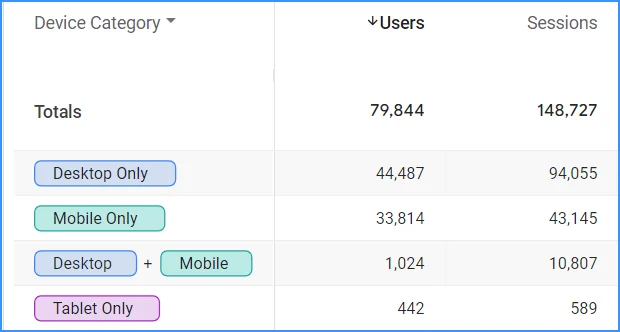
For example, this device usage statistic for the site Cityhost.ua can be seen in our Google Analytics. However, our site is mainly used for business purposes when users are looking for cheap hosting, buying domains, or renting a dedicated server for a project, so it is more frequently accessed from work computers. On the other hand, entertainment or news websites experience a significantly higher frequency of mobile device visits.
Responsive design is the key solution to ensure convenient access to a website from any device. This approach allows the size and format of the content to be automatically adjusted to fit the user's screen. Ignoring the mobile audience leads to the loss of potential customers, which can impact a company's financial performance.
Read also: Google Analytics 4 for Beginners: What is GA4 and How to Use It
Why is it important to adapt a website for different screens
Responsive design improves user experience and allows readers to interact comfortably with a web resource in various conditions — at a café on a phone, on the go with a tablet, or at work on a PC. Thanks to modern, sensitive methods of determining the screen parameters from which the web resource is accessed, the page content can be adjusted pixel by pixel to fit any gadget. No matter what device the user chooses, they will find it convenient to navigate the site.
Additionally, responsive design offers the following benefits:
-
SEO Benefits: Mobile responsiveness is a crucial ranking factor for Google and other search engines. Websites optimized for mobile devices achieve higher positions in search results.
-
Increased Conversions: The ease of using a site on a mobile phone enhances user engagement, which can lead to higher conversion rates, such as purchases, subscriptions, or form completions.
-
Broader Audience Reach: Content accessibility on any device allows for attracting a wider audience.
-
Competitive Edge: A modern and user-friendly mobile design can be a competitive advantage in a market where more people are using mobile devices to access the internet.
-
Brand Enhancement: A professional and functional mobile site contributes to a positive brand image, demonstrating that the company keeps up with technology and is focused on meeting the needs of its users.
Ways to create a responsive website
There are several ways to create a website, and various methods to implement its responsiveness for different screens. Let's look at the main ones.
Responsive Layout
Adaptive web design involves creating web pages that look and function well on various devices and screens. This ensures ease of use regardless of whether visitors are viewing them on a mobile phone, tablet, or desktop computer. There are two main approaches to implementing adaptive design: responsive design and adaptive design.
Responsive Design
Responsive design is a method of creating web pages that automatically adjust to any screen size. This is achieved through flexible elements and special styles that change based on screen width.
Key features of responsive design include:
-
Flexible grid: Web page elements adapt to screen parameters using relative units of measurement (percentages instead of pixels), ensuring a smooth transition between different screen types.
-
Flexible images: Images automatically resize according to the container size while maintaining proportions and quality on all devices.
-
CSS media queries allow different styles to be applied based on device characteristics (width, height, resolution, orientation), ensuring optimal content display for each gadget.
For example, separate styles can be defined for:
-
Mobile devices with screens less than 600 pixels (single column, simplified hamburger menu, large buttons for easy tapping).
-
Tablets with screens from 600 to 1200 pixels (two columns, more detailed hamburger menu, elements spaced further apart).
-
Desktops with screens over 1200 pixels (three columns, full menu with submenus, utilizing the entire screen space).
In essence, there's one layout whose elements can change size, appearance, and positioning depending on the device accessing the site.
Adaptive Design
Adaptive design utilizes different layouts for different devices. Developers create multiple layouts with common width sizes (320 px, 480 px, 760 px, 960 px, 1200 px, 1600 px). When you visit a website, it detects your screen size and loads the layout closest to those parameters.
Creating and maintaining multiple layouts requires more work, but it allows for optimizing and customizing content for each type of device. For instance, on a phone, you might see a simplified menu and smaller images; on a tablet, wider columns and more details; and on a computer, full functionality with all elements. The site can also display different advertisements and images depending on the device, enhancing speed and appearance.
The choice between responsive and adaptive design depends on the project's needs. Responsive design is suitable for projects requiring flexibility across devices (e.g., informational websites, news sites), while adaptive design is ideal for projects needing precise control and performance (e.g., e-commerce stores, online banking).
On average, adaptive design is more expensive than responsive design, so it's typically used when necessary.
Responsive Themes and Plugins for CMS
Modern Content Management Systems (CMS) increasingly offer responsive themes that automatically adjust for display on various devices. This is a convenient way to quickly create a site that looks good on both large monitors and mobile phones.
Read also: TOP-8 Best WordPress Themes for Blogs Relevant in 2024
Advantages of Responsive Themes:
-
Quick Setup: Installing a theme on a CMS usually takes just a few minutes, without requiring deep web development knowledge.
-
Professional Design: Many responsive themes are developed by professionals, ensuring an attractive design and high level of usability.
-
Wide Selection: There is a vast selection of themes to suit any taste and budget, allowing you to find the perfect option for your site.
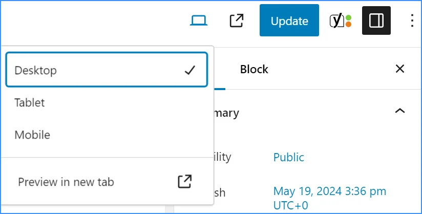
When it comes to the popular WordPress, almost all the themes you encounter for this CMS will be responsive. Even within the built-in WordPress editor, you can check how the site displays on PC, smartphone, and tablet screens. Not to mention giants of modern site building, like the Elementor plugin, where you can create different layout versions for various gadgets.
By the way, Cityhost offers hosting for all the most common engines, particularly hosting for WordPress with a convenient CMS auto-installer.
If suddenly your website already has a non-responsive theme, it's easy to fix with plugins:
-
Special adaptive plugins that automatically activate mobile design for your site when loaded on a mobile device. They optimize images, texts, and other elements for fast loading and convenient viewing.
-
Builder plugins that allow you to manually create responsive pages using a simple method of inserting content blocks. For WordPress, for example, these include Elementor, Beaver Builder, WPBakery Page Builder, and others.
However, any plugins additionally burden the site, so it's better to choose a responsive theme from the start.
Website Builders
Creating a responsive website using a website builder is very easy. First, register on the chosen builder, such as Wix or Squarespace, and select a responsive template. Then, use the visual editor to customize the design and add content. Make sure to check how the web resource looks on different devices and make necessary adjustments for mobile versions. Set up basic SEO parameters and publish the result.
Creating a responsive site with a website builder has its pros and cons. The main advantages include ease of use without programming, quick development thanks to ready-made templates, automatic responsiveness for various devices, and built-in tools such as SEO and feedback forms.
However, this approach may limit customization flexibility, require additional costs for premium features, make the user dependent on the platform, and not always allow for deep site optimization.
By the way, did you know that Cityhost.ua has a built-in website builder? It has more advantages over the aforementioned platforms — it's completely free, has no limitations on SEO settings flexibility, and allows users to download all site files at any time. You can find it in the hosting control panel.
Mobile Version
A mobile version of a website is a separate variant of the web resource optimized for mobile devices. It is usually hosted on a separate subdomain, such as m.website.com, providing quick and convenient access to the site from mobile devices.
This approach is used quite rarely and is mainly implemented on older websites, where it is simpler to add a mobile version than to completely change the architecture. For example, the creators of Facebook, which was developed in 2004, resorted to this solution — at that time, no one suspected that soon people would be accessing websites from mobile phones even more frequently than from computers.
Advantage of a mobile version is that it is much lighter than the desktop version, making it easier to "surf" with a phone.
Significant Disadvantages:
-
Possible issues with content duplication, which can negatively impact search engine rankings.
-
The need to maintain two separate versions of the site increases maintenance costs.
-
It may not display properly on all types of mobile devices with different screen sizes.
A mobile version of a site is a compromise between user convenience and operational efficiency. It is important to carefully weigh all factors before creation to ensure the optimal solution for your site and its visitors.
Choosing a Method of Adaptation for Your Project
Choosing the right approach to responsive design is not just a technical task, but a strategic decision that requires a comprehensive approach. Before starting development, consider the current state of your site and the budget you can allocate for adaptation.

Adapting New and Existing Projects for Mobile Devices
The choice of adaptation method largely depends on whether you plan to create a new site or already have one.
For a new project, the best choice is responsive design. It allows you to develop a site with mobile devices in mind from the very beginning, providing an optimal user experience on all devices without the need for further changes.
If the project is built on a popular CMS such as WordPress, Joomla, or Drupal, using responsive themes can greatly simplify the development process. This is a quick and convenient way to get a responsive site.
However, if we are talking about an existing project, responsive design may require significant changes to the site's structure. However, this will provide long-term benefits, as the website will be adapted for all devices. An alternative solution may be to create a separate mobile version. This may be a faster and less costly way to modernize, but it will lead to duplication of effort in updating content and maintaining the site, as two separate versions will need to be updated. Here, everything depends on the age of the Internet project itself — the older it is, the more difficult it is to adapt.
Before making a decision, consult with several specialists who can advise on the optimal adaptation method.
Read also: How to adapt a site for people with visual impairments
Budget for Adaptability
For projects with a limited budget, using adaptive themes for CMS is the most economical solution. They allow you to quickly deploy a site with adaptive design at an affordable price.
An alternative could be creating a separate mobile version of the site, which may be a cheaper option in the short term but requires additional support costs.
Adaptive design is more expensive in the development stage but provides significant benefits in the long term. It is an investment in user experience quality and SEO improvement, which ultimately can attract more users and higher search engine rankings.
Optimizing a site for mobile devices is not just a trend but a necessity for survival in the modern digital world. Adaptive design, builders, mobile versions, and themes are tools that can turn your site into a masterpiece that attracts users, improves SEO, and increases conversions. By weighing all factors, you can create a site that not only works on mobile devices but also outperforms competitors.