
The era of inclusiveness has already arrived, when the needs of not only the average statistical majority, but also of each individual person are important. This process is especially important for the full life of people with disabilities — and this is as much as 10% of the entire population of the Earth. Moreover, the number refers only to officially recognized disability. Add here those without formal documentation of health problems and seniors whose hearing, vision and mobility deteriorate with age.
This is a large category whose rights to a normal standard of living and access to information must be respected and implemented.
Increasingly, the IT community is talking about the fact that among Internet users there are many people with disabilities, in particular with visual impairments. They actively visit sites and use all the benefits of the network, using special software. Website owners and web developers can take a step towards them by adapting their resources to be more user-friendly for people with total or partial vision loss.
In this article, we do not use the designation "blind", as well as other words or terms that discriminate against a person and reduce his personality to a single characteristic. Visual impairment is not the only quality of people we are talking about today. It is necessary to adhere to the principle "human first". The correct wording, which we use, is "a person with visual impairments". You can find out how to speak correctly and what terms to use in the barrier-free guide .
There is a "Web Content Accessibility Guide (WCAG)" developed by the World Wide Web Consortium (W3C). It clearly describes all the requirements regarding the content of the sites and its formatting, so that the maximum number of people can comfortably use the information.
We will tell you about the basic principles of developing inclusive sites and improving existing resources. The article was prepared in cooperation with Dmytro Popov , a specialist in digital accessibility.
-
Do we need a separate version of the site for people with visual impairments?
-
How to make your site accessible to people with visual impairments
What visual impairments can there be?
When it comes to people with visual impairments, mostly only two situations are mentioned - partial and complete vision loss. But there are also such violations as:
- Myopia - a person can distinguish objects well only at a close distance.
- Farsightedness is the inability to see objects up close.
- Astigmatism — all objects are blurred, images are not clear.
- Color blindness is the inability to recognize some colors.
- Dyslexia is not a visual impairment, but rather a feature of the brain that affects the perception of text. The letters jump and get mixed up, because of which a person can see the text, but cannot read it. The needs of people with dyslexia are also taken into account when adapting the sites.
How visually impaired people see content on the Internet
There are special sites and plugins that help to understand how people with visual impairments see. These are the extensions available in the Google Chrome browser.
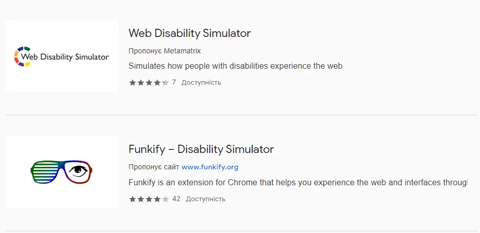
We installed the Web Disability Simulator and tested it. Thus, users with certain violations can see the Cityhost site.
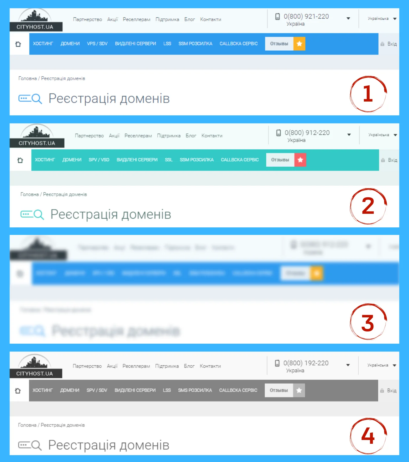
Options are marked with numbers, where:
- The original version
- Color blindness of the yellow-blue spectrum
- farsightedness
- Complete color blindness
Do we need a separate version of the site for people with visual impairments?
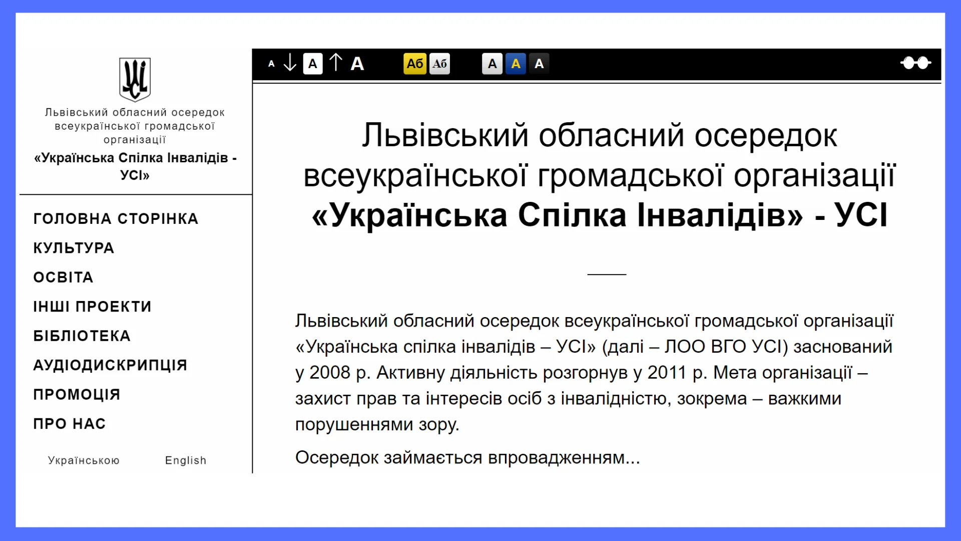
The version of the site for people with complete or partial vision loss is located on the same domain and is implemented as a separate markup option without images (or with a minimum of images), with simple navigation, the ability to change colors and the size of letters. It is marked with an icon in the form of glasses (or simply with the text "Contrast version"), placing the link at the top of the site.
There are few such examples on Ukrainian sites, most often they are found on specialized resources. For example, a separate version is available on the website of the Lviv branch of the Ukrainian Union of People with Disabilities .
The image shows the entire screen with the text maximized.
But if we talk about real practice, then special versions do not justify their purpose. In the Western world, known for a more careful approach to inclusiveness, they are practically not found.
Often, the result is an information-truncated modification, and the target audience continues to use the usual version. And it should be remembered that among the visitors there are people with various visual impairments. Many of them do not require special versions, it is enough to take a few steps to adapt the main site.
If you do decide to create such a version, then it is better not to call it "Version for people with visual impairments", because it discriminates against readers. It is better that the name is not based on human disorders, but on functions, for example, "Contrast version", "Select color scheme", "Font settings".
In addition, the contrast version can be used not only by people with impaired vision, but by anyone, being, for example, on the beach under the bright sun.
Read also: Stories of Our Users: How the Charity Fund '99 PROBLEMS' Helps People with Multiple Sclerosis
How to make your site accessible to people with visual impairments
Recommendations for creating inclusive sites were developed together with testers who have total or partial vision loss. Such specialists already work in modern companies and help others get more comfortable access to web resources.
"Air" design
Such a design can be found more and more often on websites. Modern layout involves one column for the entire screen, a minimalist layout, lots of space between elements, large photos. This is a tribute to fashion, but at the same time, such a visual is convenient for visitors with visual impairments.
To create such a site, it is not necessary to hire highly paid developers: it is enough to create a site on Wordpress or choose another CMS - they have templates with "air" design.
Color solutions
Contrasting colors also help visitors better distinguish site content. You can go two ways: either make the site immediately contrasting, or integrate the ability to switch color themes. Three options are commonly used for visually impaired visitors: black text on a white background, white on black and yellow text on a blue background.
You can check the contrast of the site using the analyzer .
There are many users for whom the white color hurts the eye, for them a dark theme will be more comfortable.
If the text is located on top of the image, the requirements for contrast with respect to the background must be met (a ratio of at least 4.5:1).
Site adaptation specialists recommend not using colors as semantic elements, so as not to complicate the task for people with impaired color perception. If a person does not distinguish colors correctly, the instruction "Press the blue button" will not be understandable for him.
Readable font
On websites, you will rarely find intricate fonts - it is inconvenient for everyone, not just for people with visual impairments. Therefore, by using simple and readable fonts, designers simplify work with text for all users of the resource.
The ability to scale the page and change the size of the letters
In modern browsers, the site scaling function is available using the Ctrl+ and Ctrl- key combinations. The task of the developers is to adapt the layout so that when the scale is increased or decreased, the site does not "crawl", elements do not disappear from the visibility zone, and horizontal scrolling does not appear.
You can also build in the ability to change the size of the letters and the spacing between them. For example, people with dyslexia find it easier to read if the line spacing is increased.
Control from the keyboard
Some users cannot see the mouse cursor on the screen, but use the touch keyboard well. They need to be able to interact with the site through keys: scroll, fill in fields, click on buttons and menu sections, without using a mouse. This function is also important for people with motor disorders.
It is important to remember the visual indicator of keyboard focus. All interactive elements (links, buttons, fields) should be visually highlighted (with the help of a frame or short tips) when navigating through the site structure using the Tab key.
Developers often disable focus in CSS with {outline: none}, but they shouldn't. Thus, some users are deprived of the opportunity to interact with the site.
Adaptation for screen access programs (screen readers)
People who cannot read even enlarged text use special programs (JAWS, NVDA, SuperNova). Screen readers read the page and reproduce it in voice mode. That is, users do not read the site, but listen.
Programs don't see text like humans do, they recognize markup. That's why it's important to make the HTML structure correctly:
-
Assign the correct tags to all markup elements. Headings should have a strict H1, H2, H3 hierarchy. Do not use header markup to increase fonts. Buttons should be arranged through the tag, menu through and so on. When the layout is visually clear, but illogical tags are used, the screen reader cannot read them correctly.
-
Use special markup in tables. Screen readers allow you to move through the cells of the table in any direction. At the same time, the corresponding column or row heading is read before the cell text, which allows you to understand the information. If tabular data is presented without tabular markup, it will be difficult for users of screen readers to understand it.
-
No PDF files. This refers to texts created in PDF as images. A screen reader will not be able to read such a text. It is best to place all articles on the site pages, but if you must use PDF files, they must be in the form of real text.
-
Correct markup for modal windows. When embedding additional elements, such as pop-up windows, into the layout, it is necessary to learn the special markup language ARIA . It allows you to make available any of the most complex interactive elements. Without this, modal windows will not be accessible to screen reader users.
-
Add alt to all images. The alt attribute was created to describe what is drawn on the picture - the text becomes an alternative to the image if it cannot be displayed correctly. Now he is prescribed keywords instead. Users will be able to learn about the essence of visual elements if the alt contains a real description of the image.
After such simple improvements, the web resource will be accessible to more people. Creating an inclusive site benefits both visitors and webmasters by increasing traffic and attracting new customers. And don't forget that caring for your neighbors and good deeds always pay off a hundredfold.
Cityhost provides hosting for sites adapted to the needs of visually impaired users. If you are the owner of such a site, write a letter to the address support@cityhost.net.ua and get hosting for free.