- Why You Need a Thank You Page on Your Website
- After Which Pages Should You Create a Thank You Page
- Rules for Creating a Thank You Page
- Common Mistakes When Creating a Thank You Page
- Examples of a Thank You Page
Creating a website is meticulous work that requires attention to detail. It's not just about creating the main pages, choosing the right web hosting, selecting a domain, and an SSL certificate, but also many other nuances. Among them is such seemingly insignificant but important detail as a thank you page on the website.
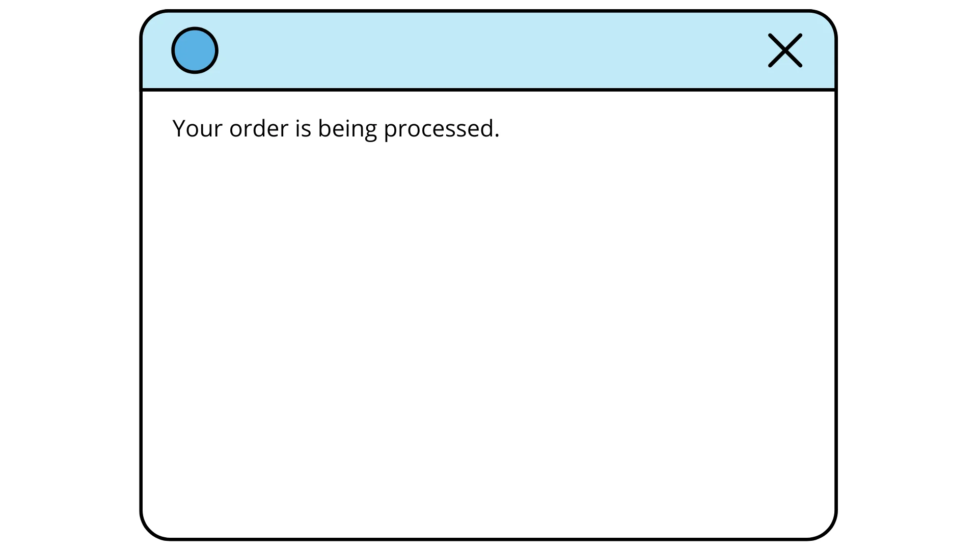
"Thank you for your purchase, your order is being processed". This is the simplest thing that can be on a thank you page. This page should be seen by the customer after they have completed a certain action on the site. The most desirable action, of course, is a purchase, but there may also be other needs — for example, collecting data for a newsletter. If the user has done what we asked them to do, it's worth showing that we are grateful and that the action has not gone unnoticed.
This is the simplest form of post-sales marketing, part of customer communication. If the customer came to our physical store, we would thank them for their purchase or for their interest in the products personally. On the website, there is a special page for this, to which the customer is automatically redirected after completing a certain action.
In this article, we will talk about what a thank you page is, what types of thank you pages there are, how to design a thank you page, and what not to do. This will help the business be more likable to people, be more memorable, and sell more. However, the ways to achieve these goals using a thank you page can vary.
Read also: How to create your website for business: independently, easily and relatively cheaply
Why You Need a Thank You Page on Your Website
Any interaction should be properly concluded, at least to explain to the buyer, for example, that their order will be delivered on time. Politeness requires at least a thank you for the purchase.
Of course, you can approach this page purely functionally: confirm that the order or data has been received, say "thank you, have a nice day". This response to the action itself creates an understanding for the customer of what will happen next. And a transparent process reduces the number of questions and increases the likelihood that they will turn to you again.
However, a thank you page can solve a whole range of additional tasks:
-
inform that the site has a useful newsletter or social media groups;
-
announce promotions or new products;
-
help understand the purchase (for example, download a free guide or provide links to useful articles);
-
call to action (subscribe to the newsletter, leave a review and get rewarded, etc.);
-
improve the customer's mood. We remember where we had fun and felt good and want to go back there.
If we aim not just to make a sale once but to build long-term relationships with customers, the thank you page is an opportunity to strengthen them. In addition, additional information contributes to:
-
increasing the time spent on the site if the customer goes to see interesting blog posts or read a guide;
-
stimulating new purchases, especially if you have offered a discount or promo code;
-
generating reviews. People often don't think about writing them, but when asked directly, they are more willing to do so.
Finally, if you have opportunities such as discounts for inviting friends or subscribers to the site, the thank you page potentially stimulates the appearance of new customers.
Read also: How to verify a user on the site: calls, SMS, e-mail
After Which Pages Should You Create a Thank You Page
It makes sense to acknowledge any completed interaction that requires more from the customer than just scrolling the page and visiting posts. If this action is beneficial to us, we should thank them for it. The simplest examples are:
-
purchases;
-
donations to support a blog or informational website;
-
inquiries and feedback;
-
registration in the user's personal account;
-
subscription to a newsletter;
-
participation in a survey.
You can even respond with an automatic thank you for a complaint or ticket sent to customer support. This way, resolving the issue will start with a correct response.
The list can be individual based on how the site works as a whole.
It's worth developing a separate thank you page for each case to write the correct text there — "thank you for your purchase", "thank you for the information", "thank you for your contribution", "thank you for your inquiry", and so on. And now let's look at what else can be on such a page.
Rules for Creating a Thank You Page
There are not many rules for creating a thank you page:
-
the page should correspond to the general style and Tone of Voice of the brand (we wrote about Tone of Voice here);
-
the page should not be overloaded with elements or text;
-
the page should transparently inform the customer about what will happen next. For example, that the webinar for which applications were accepted will take place, at what time, and how to join it;
-
it is desirable for the page to solve at least one additional task — entertain, add impressions or additional value to the purchase, share content, etc.
The additional value that such a page can carry is a key moment to consider. You can add various things to the thank you page:
-
mood. For example, it could be a funny message like "our cat is already working on it", a funny picture, or a meme. This works just like the famous predictions on receipts at Silpo — absolutely not necessary, but everyone loves them;
-
information. You can provide contact information for customer support if there are any questions, a guide on how to use the product or take care of it, useful articles on the topic;
-
incentive for further interaction (a promo code for future purchases, a referral discount for bringing friends, points accruing in the loyalty system, etc.);
-
encouragement to continue shopping (this could be just a "continue shopping" button, or it could be a carousel of other products in the catalog);
-
call to communicate. This could be a button to join a group on social networks, subscribe to a newsletter, or a request to leave a review.
You can combine several of these additional points into one (for example, a discount could be for subscribing to social networks, a review could earn a symbolic point in the loyalty system, etc.).
However, it is important to limit the number of elements on the page so that the eyes do not wander and the main message is not lost. For example, one thank you, one gift, one clear call to action (subscribe, leave a review, continue shopping, etc.). Over time, by collecting statistics, you will be able to understand what works best.
Read also: How to protect a WordPress site and not become a victim of open source vulnerabilities
Common Mistakes When Creating a Thank You Page
The biggest mistake is not thinking through such a page and not working on it. A too simple, dry message shows the person that you have received everything you wanted, and they are no longer interesting. Instead, it is important to continue the dialogue at least for a reply, so that the customer leaves with a sense of their importance, interest to you, and the thought of returning.
A too concise page is one that only thanks and confirms the action, without encouraging anything else. This does not harm the reputation, but it also does not promote the business.
The second mistake, in contrast to the first, is overloading the page with elements so that the user's eyes wander and they cannot focus on anything. In this case, it is likely that no idea you are trying to convey with this page will work. Users will simply close it.
Finally, the page should not stand out from the overall tone in which the company communicates with customers. For example, a funny picture is a great idea to diversify the thank you page, but not when the whole site is very restrained and formal.
Examples of a Thank You Page
Let's imagine you are selling online courses. After a potential learner purchases a course and receives the mandatory feedback about the payment, what else can you offer them?
What can entertain or interest someone who has just paid money? You can go the gift route. For example, offer a discount on future courses for this customer or a friend they choose.
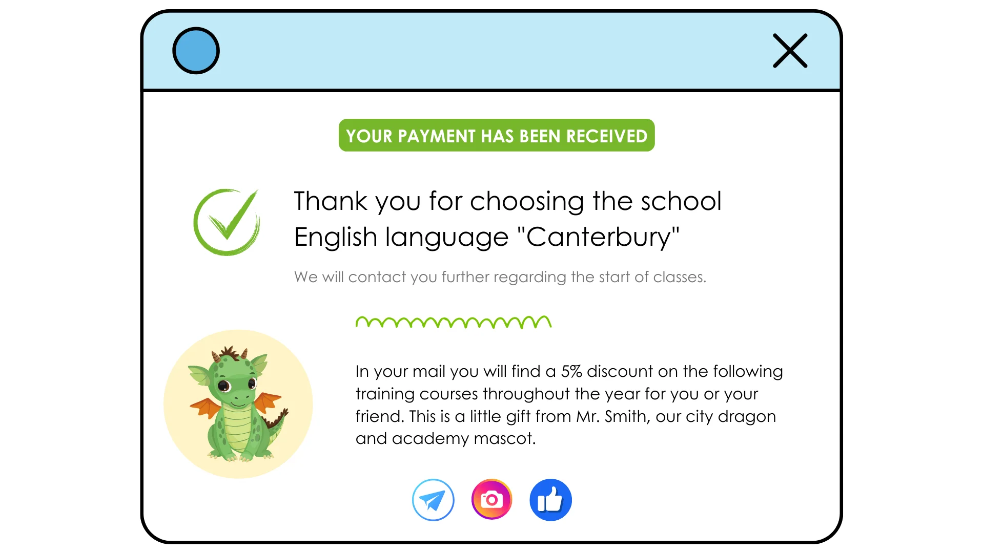
So, you could write: "Thank you for choosing our English school, Canterbury. We will contact you separately regarding the start of classes. In your email, you will find a 5% discount on future courses for you or your friend within the year. This is a small gift from Mr. Smith, our city dragon and academy mascot". Here, a funny dragon is appropriate.
It's worth adding that you can follow us on social media for updates, but there are already many pictures, so we'll stick to minimalist icons.
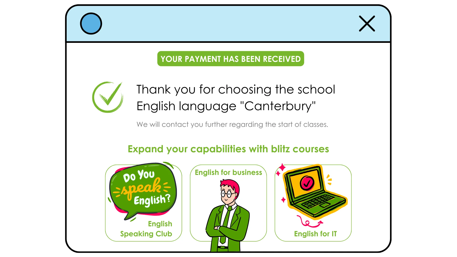
Here's another option — we can take the same school and use a different approach. Let's try to suggest to the student to consider further study. Let's immediately place a carousel with interesting courses or workshops that can complement their education. This could be a Speaking club, short-term courses to improve grammar or specific business vocabulary. Then there will already be a lot of content on the page, and it might be worth removing social media links, and maybe even a funny picture, if the course previews already have pictures.
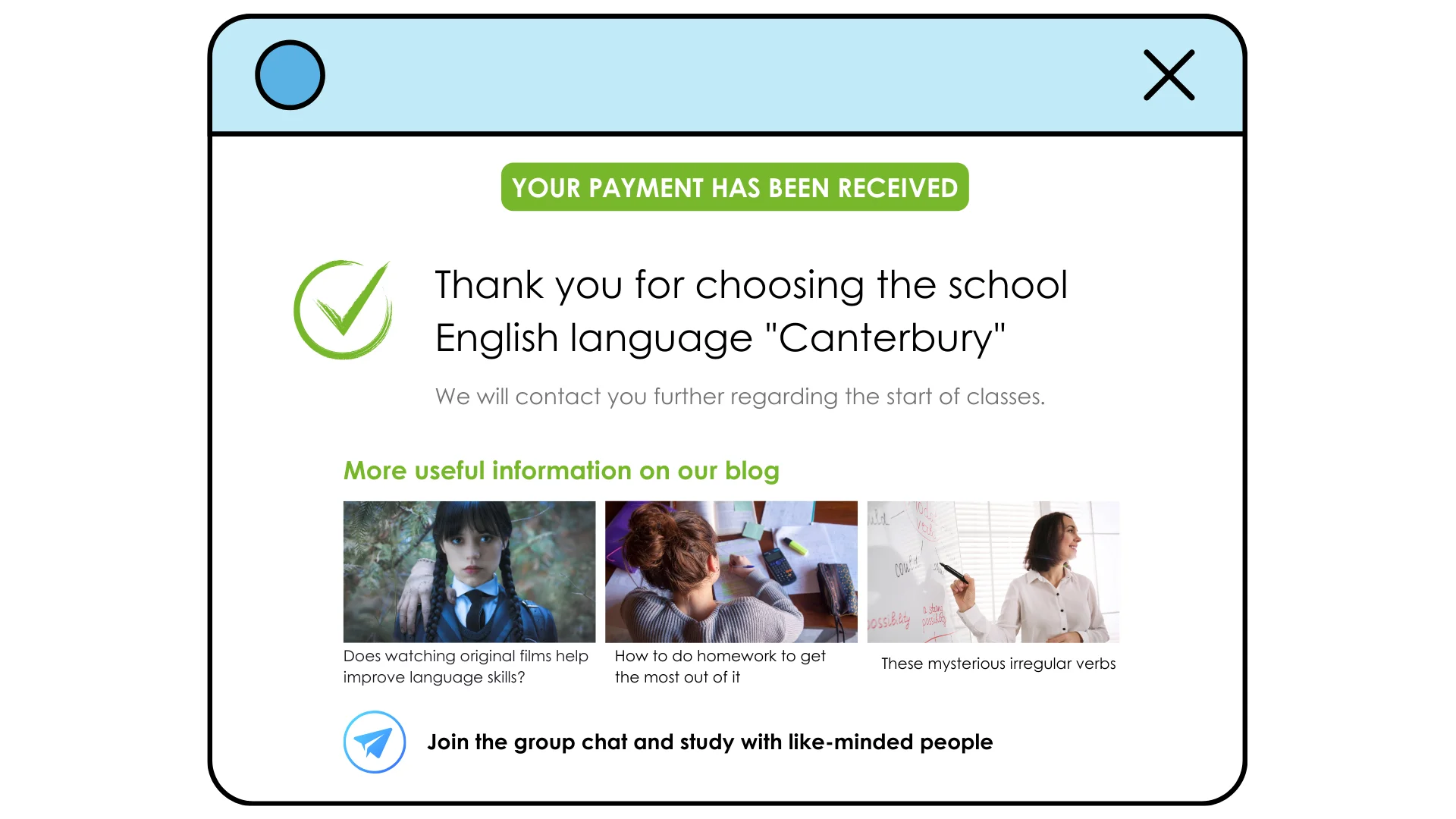
Let's try to make the thank you page completely different: provide even more useful information. "Thank you for choosing our school..." Here, a carousel of blog posts would be appropriate, helping at the beginning of the study: "Does watching movies in the original language help improve language skills?", "How to do homework to get the maximum benefit", "These mysterious irregular verbs". Then, a call to join the group's Telegram chat to immediately integrate the new student into the community. This way, the student will feel cared for, and will be able to start integrating into the process right away. This is also a way to build communication.
How exactly to build a thank you page largely depends on how communication with customers and readers is constantly conducted. The key to success is to have a good understanding of your audience, the person you need to address. Then, gratitude can become another factor in favor of long and fruitful communication.
