
- What is website responsiveness
- What’s better: a responsive website or a separate mobile version
- How to check website responsiveness
- How to make a website responsive
For several years now, the Internet has no longer been tied to PCs or laptops. According to Statista, in 2025 there are approximately 6.84 billion smartphone owners worldwide, and this number is expected to increase to 7.21 billion by the end of the year. Such growth rates lead search engines to make website responsiveness one of the key ranking factors. And today we will talk about how to meet the strict requirements of users and search engines.
What is website responsiveness
Website responsiveness — its ability to display correctly on the screens of different devices. An adaptive blog or online store is convenient to view on laptops, netbooks, smartphones, tablets. Online resources that display “crookedly” on any of these devices repel visitors, and accordingly potential customers.
Since 1 July 2019, Google has automatically applied Mobile‑First Indexing to all new sites. That is, if a site was created after this date, its positions in the search results will be determined based on information obtained from the mobile version. Simply put — new non‑adaptive blogs, portals, forums, online stores are unlikely ever to rise to the first positions in Google’s results.
A refined site structure — no less an important promotion factor. Blogs and online stores with a small category depth and content‑relevant names enter the TOP of search engine results faster.
What’s better: a responsive website or a separate mobile version
"Wouldn’t it be easier to create a copy of the site in the form of an app for smartphones, and leave its current non-responsive version for desktops?" — most likely, this question has already crossed your mind. Not a bad option. Except for the pile of pitfalls you'll face if you go this route:
- You’ll have to create an app for both iOS and Android. Even with special constructors, this is expensive and takes more than a day. Implementing website responsiveness for mobile devices is cheaper and faster.
- You’ll need to come up with a solution for automatic data exchange between the main site and the app. This also requires considerable costs and time.
- Users will have to download and install the app. Not everyone will want to do this. Especially if your web resource is not very popular.
- You’ll lose traffic. Google may never find out how many people are performing actions in the app. And it definitely won’t combine this traffic with the desktop version’s traffic.
As you’ve probably already realized, it’s better to create not several versions for each device, but one version that’s convenient to view on screens with any resolution and aspect ratio. Once your project becomes popular, you can even create a no-code mobile app yourself, promote it along with the site, and connect monetization to it for additional income.
How to check website responsiveness
Browsers, including Google Chrome and Firefox, have built-in developer tools that allow you to see how a site is displayed on different devices. To use this feature, go to the online resource you want to check for responsiveness and press F12 on your keyboard (or right-click on the screen → “Inspect”). In the new window, click the icon that looks like a smartphone and select a specific device model.
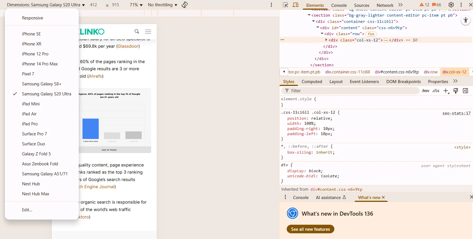
Example of checking Backlinko's website for responsiveness via Google Chrome
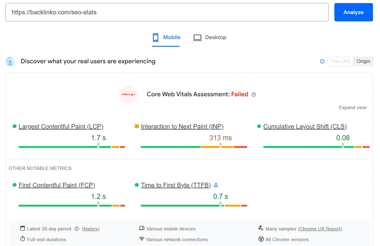
How to check a website for responsiveness in other ways? There used to be a Mobile-Friendly Test tool, which was later merged with Lighthouse. Now the simplest way to check is PageSpeed Insights.
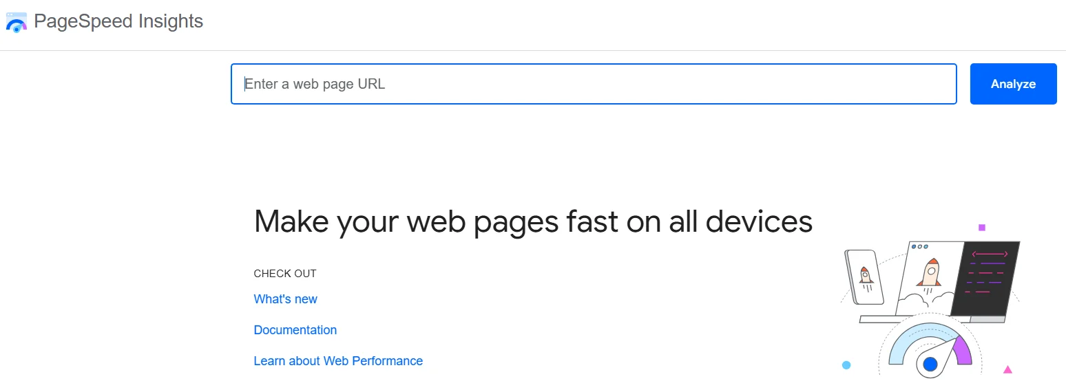
Go to the main page, paste the page URL, and click Analyze. Then you’ll receive a Core Web Vitals Assessment with the ability to analyze each item (LCP, INP, CLS, and others). Plus, there are links to pages with information about each metric and methods for improvement.
How to make a website responsive
First of all, fix the errors found by the mentioned Google tool. In addition, make sure your online store, blog, or portal meets the following requirements:
- the height and width of images automatically adjust on screens with different resolutions;
- font sizes increase on small-screen devices and the text is easy to read;
- if the site is opened on a device on which it hasn’t been opened before, a responsiveness check is performed automatically and its results are sent to the developer;
- a website hosting service has been selected where web pages load quickly even with a low user internet connection;
- the design automatically adjusts on devices with different aspect ratios and screen resolutions — the online resource is convenient to use on both a widescreen monitor and a smartphone with a 4-inch screen.
Now you know what website responsiveness is, what it affects, and how to check it. You can now move on to a more detailed analysis of ways to adapt a website for mobile devices and apply them in practice. This way, you’ll be able to create a blog, online store, or portal that’s convenient to use on any device and loved by search engines.