- What Is a Website Homepage and Why It Determines Everything
- Homepage Under the Microscope: What Elements It Consists Of
The homepage of a website is the first thing users see when they visit your web portal. Its proper design influences the first impression of your company and determines whether visitors will stay on the site. This concerns not only an attractive design but also a logical structure, simple navigation, and relevant information that meets the needs of your target audience.
An effective homepage is not just about appearance but also technical aspects. These depend on the hosting for the website you choose, the loading speed, and the logic of interactive elements. We will discuss all these aspects today.

What Is a Website Homepage and Why It Determines Everything
A website homepage is not just a business showcase but a strategic tool that decides whether a visitor will stay on the site. It has only a few seconds to capture the user’s interest, explain what the company does, and encourage further interaction.
An effective homepage includes key elements: a clear title that conveys the main idea, a brief description of the company or product, competitive advantages, and intuitive navigation. It is important not to overload it with unnecessary details—the homepage should guide users to the right sections rather than trying to convey everything at once.
A well-structured layout, high-quality content, and user-friendly UX design make the homepage not just visually appealing but truly effective: keeping visitors engaged, increasing conversion rates, and improving search engine rankings.
Homepage Under the Microscope: What Elements It Consists Of
Every webpage—including the homepage—has three main components: the header, the main section, and the footer. Each of these consists of several elements, and their proper design affects not only the overall aesthetic harmony but also the user experience. Let’s discuss how to properly structure each of these sections.
Website Header: The First Thing a User Sees
The website header is the top part of the page, which usually remains unchanged when navigating to other pages of the site.
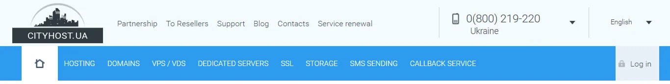
It serves an important navigational function and includes the following elements:
Logo
A company’s signature mark that helps users identify the brand. The logo should always include a link to the homepage, allowing users to return to it when needed.
Contact Information
The header typically contains brief contact details, such as phone numbers. These may also be duplicated in the footer, while full contact information is usually provided on a separate page.
Support Contact Button
Some websites feature an icon of a “person with a headset” or another symbol indicating direct support access via chat. This additional option simplifies the user’s path to a specialist who can assist them.

However, this feature is not present on all websites, and it’s worth considering whether it is necessary in the header. Often, it is placed within user accounts so that only company clients can contact support. For example, in our case, this function is available in the control panel.
Instead of placing the button in the header, another common solution is a help chat at the bottom of the screen, which is accessible across all pages of the site.
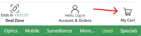
Shopping Cart
If you have an online store, the cart should be placed in the header so that the client can access it from any page and complete their order once they have selected all items.
Navigation Menu
The menu is an interactive element containing a list of links to the main sections of the web portal, ensuring easy navigation. Create a concise and simple navigation tree so that the user can understand what they will see when they navigate to a particular section.
The menu is organized in a classic scheme and leads to the following pages:
- A page with products or services, which may be called “shop,” “catalog,” “partnership,” or other similar terms. You can also create separate menu items for different categories of services or products—for example, as we do, where there are pages for domain registration, dedicated servers, and VPS, as well as file storage and SSL certificates.
- A company description or “About Us” page, which includes the business history, main achievements, mission, service or product concept—everything you want to share about yourself.
- A FAQ section, where the main answers to questions can be found.
- A blog, news, or “Useful” section—often the part with articles dedicated to business news and information users need.
- A portfolio—this section can be named differently, but the key is that it presents samples of completed work.
- Contact details, which contain complete information—address, emails for various departments, and a marker on Google Maps.
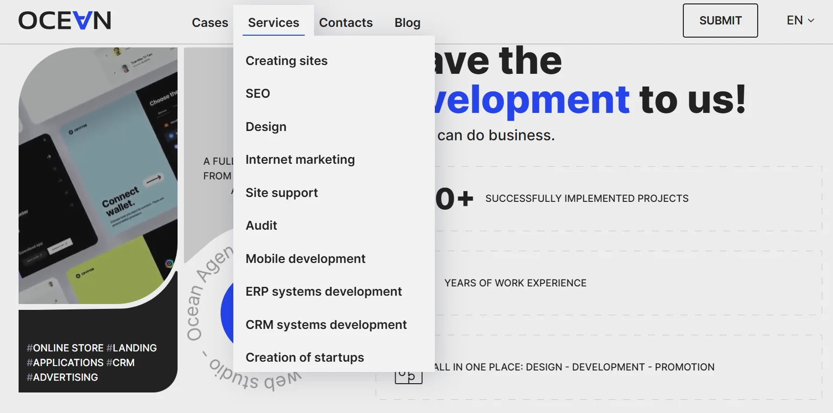
Each business owner can design the menu as desired—it can be very concise or extensive. It is advisable to consider having two levels of menus so that there aren’t too many items in the header—this will appear stylish and neat. For example, as seen here.
Social Media Buttons
A link to the company’s social media pages serves multiple purposes. Active social media accounts build more trust with users. A website appears static, and the last update date can typically only be seen in the blog or news section, if available. By following the link and checking out recent posts, users learn more about the company and confirm that it is actively operating.
Additionally, different social media platforms allow for varied messaging, enabling communication in a way that resonates with each segment of the target audience. Some prefer the entertaining format of TikTok, others enjoy educational videos on YouTube, some read long posts on Facebook, while others appreciate the visual aesthetics of Instagram.
However, social media buttons are not always placed in the header—they are increasingly found in the footer.
By the way, Cityhost recently launched its own TikTok, and we invite you to subscribe.
Search Bar
The header can also include a search field to help users quickly find the products or services they need.
Since many people build websites themselves using CMS platforms, it's important to plan how to implement a search module in such cases. You can check out our article Searching for information on the site: overview of modules and ready-made services.
Login/Register Button
This button may also be labeled “Dashboard,” “Your Account,” or similar.
If your website requires user accounts, the login or registration button should be prominently displayed, preferably in the header, in the top right corner. This is where users typically expect to find it.
Language Selection
If your website has multiple language versions, place the language switcher in a visible location in the header.
By the way, according to Ukrainian law, websites must default to the Ukrainian language version for users. We covered this in our article In Ukrainian, please — a law is coming into force that obliges websites and programs to be translated into the state language.
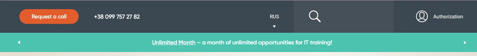
Announcement Banner
Important promotions and announcements can be displayed at the top of the site, attached to the header (above or below). This element appears as a bright strip with a text message and a link to a page with more details.
Here’s an example of how it might look.
The main principle of menu design is to include only essential sections. Stick to a traditional structure that users are familiar with, while also considering the specifics of your business. Clarity, intuitive navigation, and conciseness are key to an effective menu.
Media Content in the Header
Sometimes website owners want to include a banner, carousel, or video in the header to highlight important messages, promotions, or showcase popular products and services.
However, this practice is outdated—it was a mainstream trend in the 2010s. Modern design favors simplicity and lightness, keeping in mind that many users access websites from smartphones. Such elements increase page weight and can slow down loading times, especially on mobile networks.
That said, media content is often used on the first screen of the homepage, which we will discuss next.
Read also: How to Adapt Your Website for Mobile Devices
First Screen: A Magnet for Attention
The key element of the body is the first screen since it’s the first thing customers see when they open the page. It’s important to understand that the header and the first screen are not the same. The header may only take up 2–3 centimeters at the top and contain just the logo, menu, and phone number. Everything below it changes across different pages.
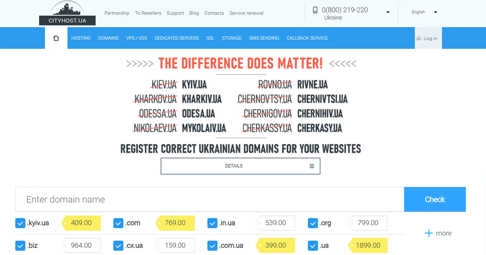
For example, on our main page, the first screen features a light banner with a call to register proper Ukrainian domains and a button linking to the domain page. However, this banner is not part of the header—it is exclusively an element of the homepage. Additionally, the first screen includes a field for checking domain availability and several suggestions for popular domains.
Currently, it’s a best practice to place a phrase on the first screen that immediately informs users about the nature of the business—whether it's a marketing agency, a web development studio, or an electronics store. This element is implemented purely through code, ensuring it doesn’t overload the page while still making an impact.
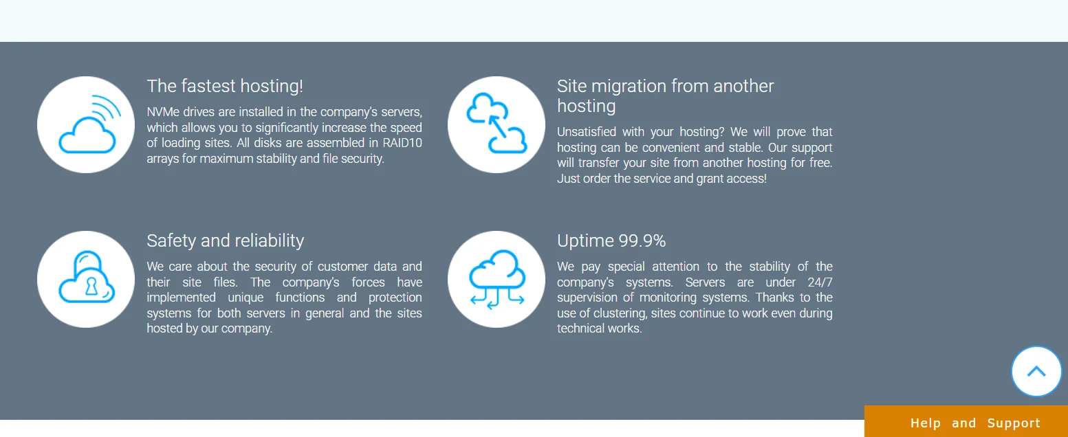
Content That Works: Presenting Information Without Overload
The main part of the page is the content that represents your brand, products, or services. This section contains the most crucial information for users. The Main Content includes the following key components:
- a general description of products or services;
- popular offers, promotional products;
- calls to action—such as requesting a consultation, estimating service costs, subscribing to a newsletter, or visiting the store;
- an explanation of the benefits of working with the company;
- answers to frequently asked user questions;
- achievements in numbers;
- customer reviews;
- partners and well-known client companies.
It’s best to place important information—such as promotions and the most popular services—immediately after the header and first screen. For instance, on the Cityhost website, the hosting tariff section is placed right on the homepage because it is our most in-demand service.
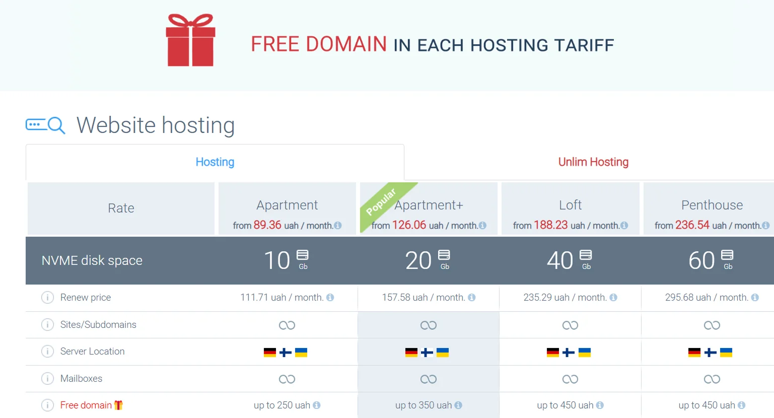
Further down, we include texts describing the features and advantages of our hosting, as well as the benefits of working with Cityhost. Even lower on the page, you’ll find answers to frequently asked user questions.
Footer: A Small Detail That Makes a Big Contribution to UX
The website footer (or footer) is the lower part of the page, which also remains unchanged when navigating through different sections of the web resource. It contains additional information that may be useful to users:
- Menu — duplication of links to the main sections of the site and additional items you want to offer users.
- Contacts — detailed company contact information.
- Social media links — a block with social media logos and embedded links to the company's pages.
- Sitemap — a section listing all website pages for easier navigation.
- Links to regulatory documents — such as the privacy policy, cookie policy, and other terms of use.
- CTA (Call to Action) — such as "Request a Call," "Get a Consultation," etc.
- Copyright notice and terms for using materials on other platforms.
- Years of company operation.
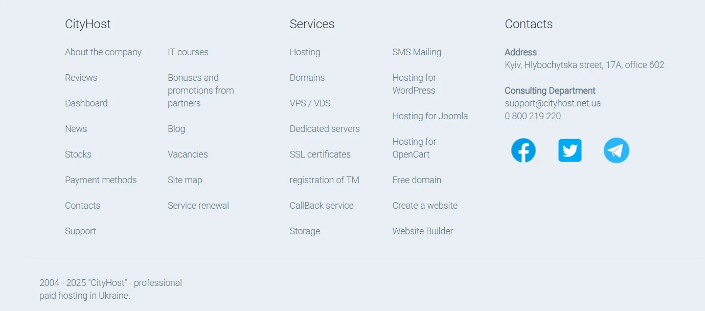
The footer serves as an additional menu where more sections can be included, thanks to the extra space available.
We’ve examined the structure of the homepage and its components. It's worth mentioning that user experience is influenced by many other factors beyond just the main page, including loading speed, design, SEO, responsiveness, and more. Naturally, these aspects should be well implemented on the homepage first and foremost.
The homepage must fulfill several key functions: presenting your company, introducing products or services, ensuring easy navigation, and motivating visitors to take action. That’s why its design should take multiple factors into account, such as the target audience, company branding, usability, and search engine requirements. A carefully planned homepage design is the key to the success of your website—and your business as a whole.