- What Is a Brand in the IT Sphere
- Key Elements of a Successful Identity
- Brand Analysis: Practical Examples
- How to Create a Memorable Brand: 7 Steps
- Common Mistakes When Creating a Brand
In our time, when everything changes almost instantly, IT companies need not just to be visible — they need to be memorable. Technology is developing at a crazy pace, competition is increasing, and users are no longer satisfied with something that just "works". They want to feel that there's something more behind the product — character, emotion, a clear message. And here, a strong brand is not an extra "feature", but a real necessity.
Identity is much more than a good logo or trendy colors. It's about how a company presents itself, how it speaks, what meaning it puts into every element. When the visual style, tone of voice, and positioning work together, they create a unified image that stays in the mind for a long time. That's when a brand begins to live not only on screens but also in people's consciousness. At the same time, it’s important to remember that no brand identity will save a website that constantly freezes or loads slowly — high-quality hosting and a stable technical foundation are a silent but critical support for how the brand is perceived.
What Is a Brand in the IT Sphere
In the context of technology, a brand is more than just a name. It’s a promise. It’s the experience a client receives when interacting with a product or service. Identity, tone of communication, visual style — everything must convey one idea: who you are, why you exist, and how you benefit the user.
A good IT brand:
- builds trust (especially important for B2B);
- sets expectations for the product;
- increases recognition and loyalty;
- helps attract investors and partners;
- simplifies marketing and sales.
Key Elements of a Successful Identity
Identity is not just a set of visual elements — it’s the architecture of your brand that forms the first impression of the company and its product. Through identity, companies convey their values, demonstrate professionalism, and build emotional connections with users. For identity to work effectively, it must be not only attractive but also logical, consistent, and coherent.
When creating a brand’s visual image, pay special attention to the following key elements of identity:
- Logo — this is the central element of identity. It must be simple and memorable. A good logo is easily recognizable even at small sizes or on a black background. Ideally, the logo should reflect the essence of the brand — through a symbol, idea, or emotion.
- Domain — one of the key elements of identity in the digital space. It’s the first thing a user sees in search results or in a link. A successful domain name choice helps create a clear, simple, and brand-matching address that is easy to remember. This builds trust even before someone visits the site. Avoid complex spellings, hyphens, or ambiguous words that may confuse the user. A well-chosen domain name works like your company’s business card on the internet, reinforcing brand integrity.
- Color palette and fonts — important tools for setting the mood. Colors evoke emotions and create associations. Blue is often associated with trust and stability, yellow — with energy, red — with determination. Fonts should match the overall tone of the brand: strict for B2B, soft — for lifestyle products. When choosing colors and typography, you should consider their readability and versatility in digital environments.
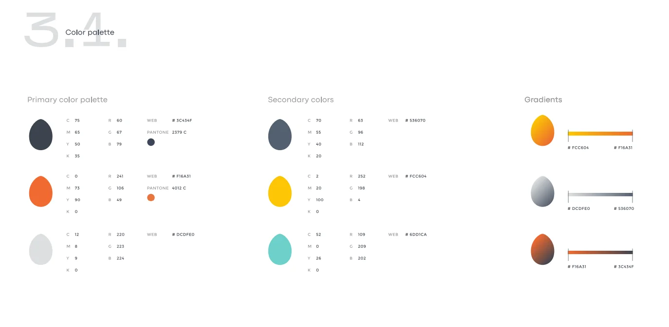
This is what a clearly defined color palette looks like in a brand book.
- Slogan — a short but powerful phrase that communicates the brand’s key message. Ideally, it’s a combination of mission and emotion. It should be easy to remember and versatile in use. A good slogan not only tells about the product but also creates a sense of belonging.
- Brand voice, or tone of voice — this is how the company speaks to its audience. It can be a restrained formal language, a light ironic style, emotional, or even slightly provocative. The main thing is that it should be appropriate and match the character of the brand. If the company speaks the same way everywhere — on the website, in social media, in the app or support emails — this creates a sense of consistency. And from consistency comes trust.
- Visual templates and graphics — this is what creates the brand’s atmosphere. Icons, illustrations, photos, colors, styles — all of this together sets the tone. A well-thought-out visual language strengthens recognition: sometimes a brand can be recognized even without a logo, just from an image or post. If the visual style “speaks” the same language as the text — this is true synergy, which works for the brand every day.
- Coherence and adaptability — identity must be convenient to use across all channels: web, mobile app, print, presentations, social media, and so on. It should retain recognizability regardless of the platform. Adaptability is the ability to look organic and appealing in any environment. Here, guidelines play an important role, describing exactly how to use the logo, colors, fonts, and more.
Everything works when the elements are united in a single story. If the visual part aligns with the brand’s voice, if it matches what you say and how you behave, that’s when trust is born. People begin to recognize you, remember you, feel connected. And that’s what opens the door to scaling, expansion, and long-term growth. Because a strong brand is not only about design — it’s about the feelings that remain after interacting with you.
Read also: Extraordinary Ukrainian Businesses and Marketing Strategies That Truly Work
Brand Analysis: Practical Examples
To better understand what successful brand identity looks like, let’s look at examples of Ukrainian companies that have managed to create a recognizable, strong, and emotionally appealing image. Their experience will be useful to those who want to build their own unique brand.

MacPaw
MacPaw is a Ukrainian IT company well known around the world for its macOS software. Its visual style is all about cleanliness, simplicity, and a love for thoughtful design. Their paw-shaped logo is not just a symbol, but something warm, recognizable, and friendly.
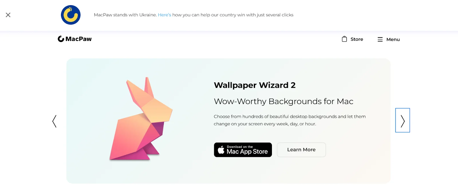
There is a sense of restraint throughout their identity: lots of light, minimal excess, maximum logic. This style seems to say: “We don’t get in the way — we help”. The brand’s communication is calm, friendly, without excessive emotion, but with great attention to detail.
Reface
Reface is a brand that became instantly recognizable thanks to its creativity and viral effect. Everything is built around dynamics: logo, animations, visual style — everything moves, plays, changes. Their slogan, “AI that entertains”, clearly conveys the essence — to make complex technology fun and accessible.
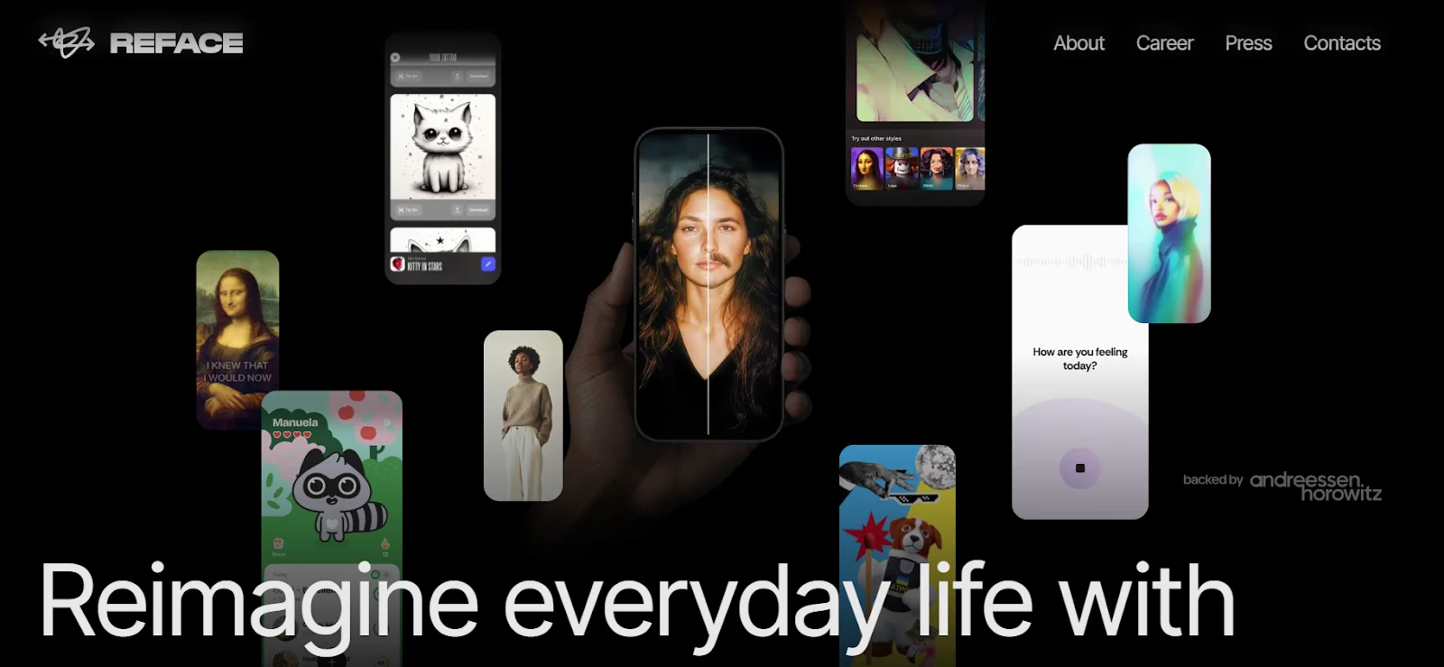
The tone of communication is light, slightly humorous, and definitely not boring. They know how to speak the language of TikTok, memes, and modern culture. And that’s exactly why they are instantly recognizable: Reface is about emotion, entertainment, and the new digital era, where artificial intelligence doesn’t scare — it entertains.
Ajax Systems
Ajax Systems is serious in everything — from device design to its slogan. Their phrase “Rule your space” sounds both powerful and subtle — it’s about control, confidence, and technology that works for the user. The brand speaks clearly and concisely — just like their products operate. The black-and-white style, restrained graphics, and direct messaging all speak of reliability.
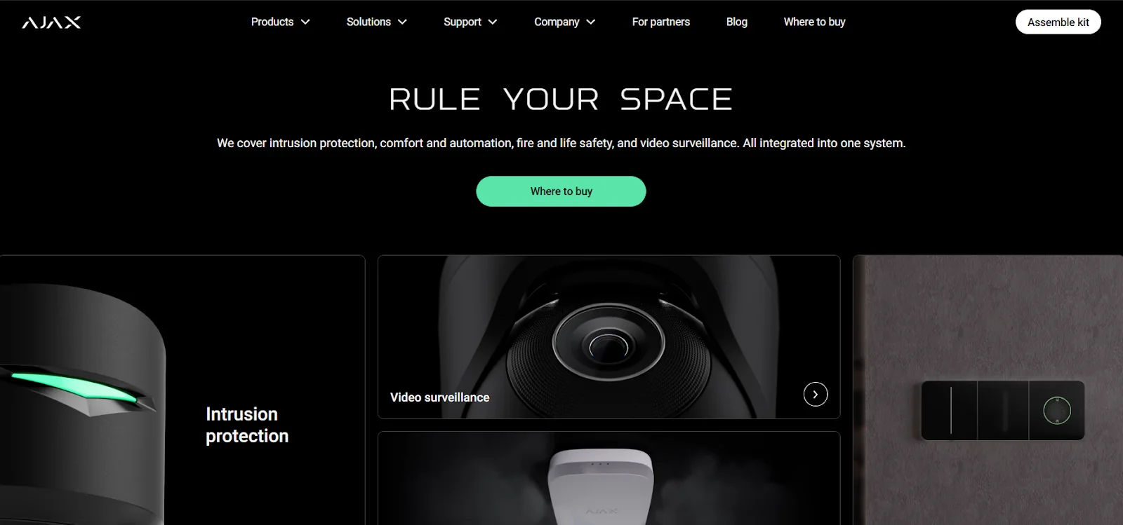
Ajax Systems has built the image of a company trusted by private homes, offices, and international clients. They don’t play marketing games — they claim they will make the world safer and prove it with every detail of their visual style.
Monobank
Monobank is financial technology made human. Black dominates their identity — a symbol of minimalism, technological edge, and a certain challenge to traditional banks. The logo — a simple letter “m” in a black circle — is easy to remember and works well as a digital icon. The brand’s communication is light, sometimes humorous or even cheeky, which appeals to a younger audience. Monobank masterfully plays with text and visuals in digital spaces, using memes, infographics, and bright illustrations.
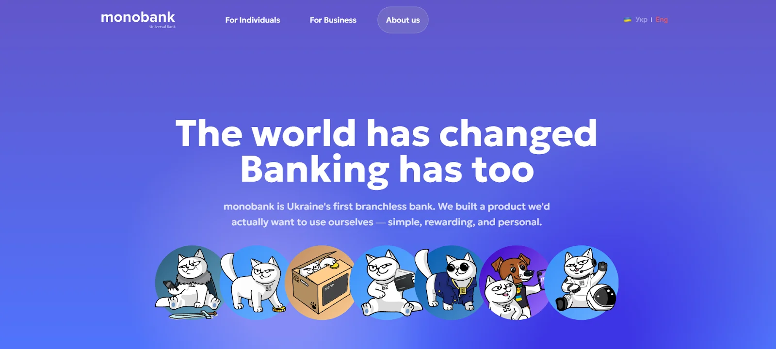
The cat — a well-known character of the company — creates a friendly and relaxed tone of voice. This builds a light and pleasant atmosphere for interaction, giving the brand an advantage over serious and overly bureaucratic state banking institutions.
This is a brand that explains complex things in simple language — and does it with style. Monobank doesn’t have an official slogan in the classic sense, but its positioning is often accompanied by the phrase: “The bank in a smartphone”. This isn’t just a phrase — it’s a promise. All of the bank’s communication follows this idea: convenient, fast, no lines or paperwork.
GitLab
GitLab is a global DevOps platform with Ukrainian roots. The brand’s identity stands out with warm colors — primarily orange, symbolizing energy, openness, and positivity. The logo — a geometric depiction of a fox’s head — effectively conveys the flexibility, speed, and cleverness inherent to DevOps culture.
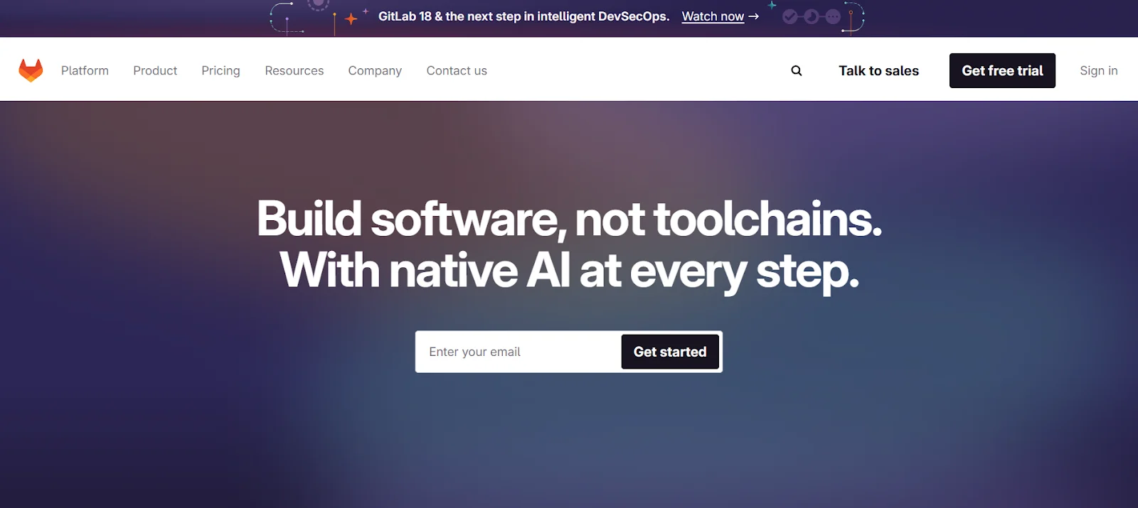
The visual style is simple yet meticulously designed: convenient typography, logical structure, and a clean UI. The tone of communication is open and trusting, which aligns with open-source values. GitLab is a brand that promotes the idea of teamwork and transparency.
Read also: How to Adapt Your Website for Mobile Devices
Uklon
Uklon is a national ride-hailing service positioning itself as a tech-savvy alternative to foreign platforms. The brand’s visual identity is dynamic but restrained: modern fonts, simple icons, and a predominance of white background with bright elements that stand out well in the app.
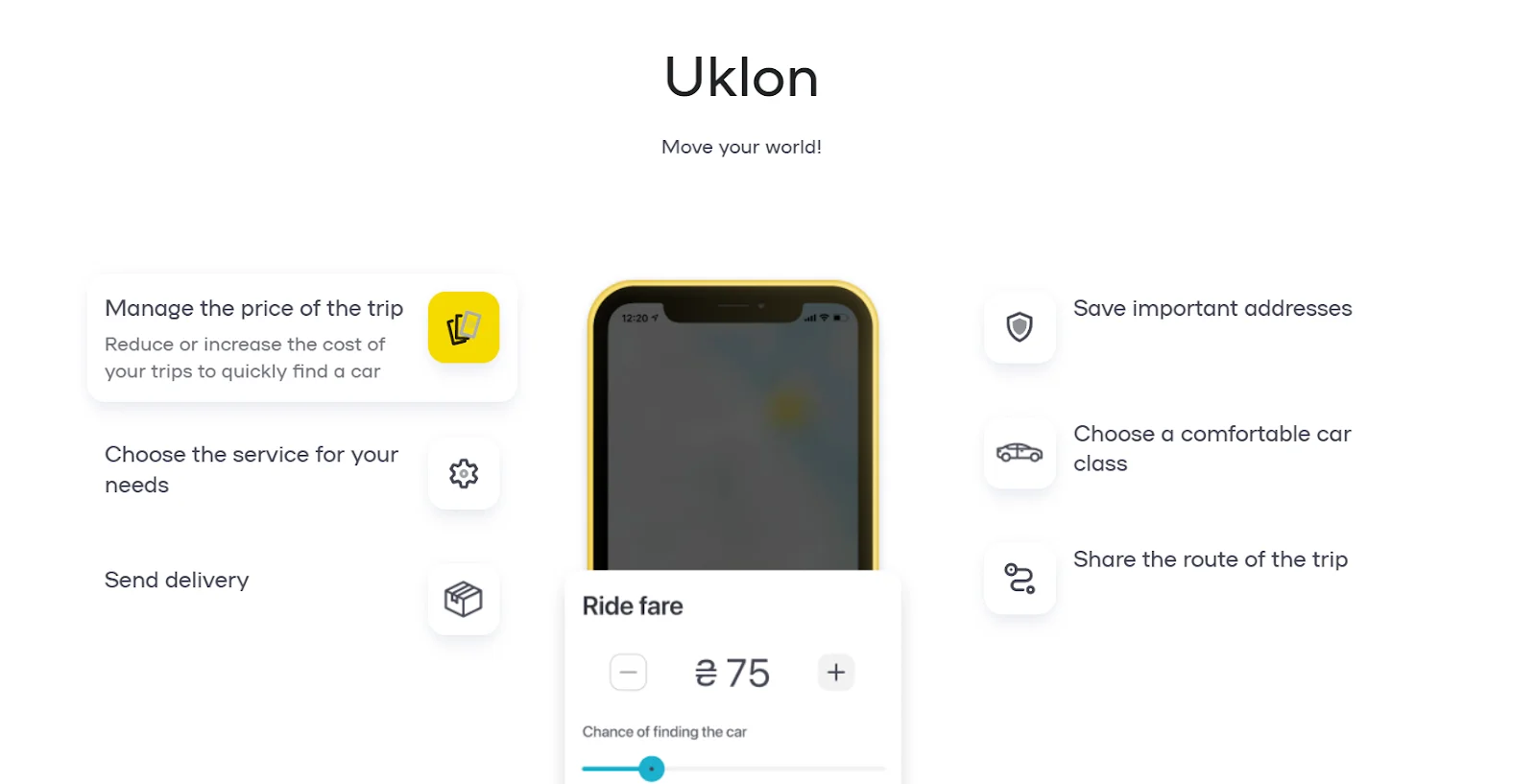
The arrow in the logo symbolizes motion and direction — a perfect fit for a logistics service. Uklon speaks to its audience in a friendly yet professional tone. Their style strikes a balance between efficiency and accessibility. They don’t shout that they’re the best — they show it. Uklon’s slogan: “Your way — our priority” concisely and effectively conveys the core message: the service cares about you, your comfort, and your time.
Depositphotos
Depositphotos is one of the most well-known Ukrainian stock content services operating on the global market. Their logo — a stylized letter “D” in the shape of a swirl — hints at creativity, flow, and the infinity of ideas.
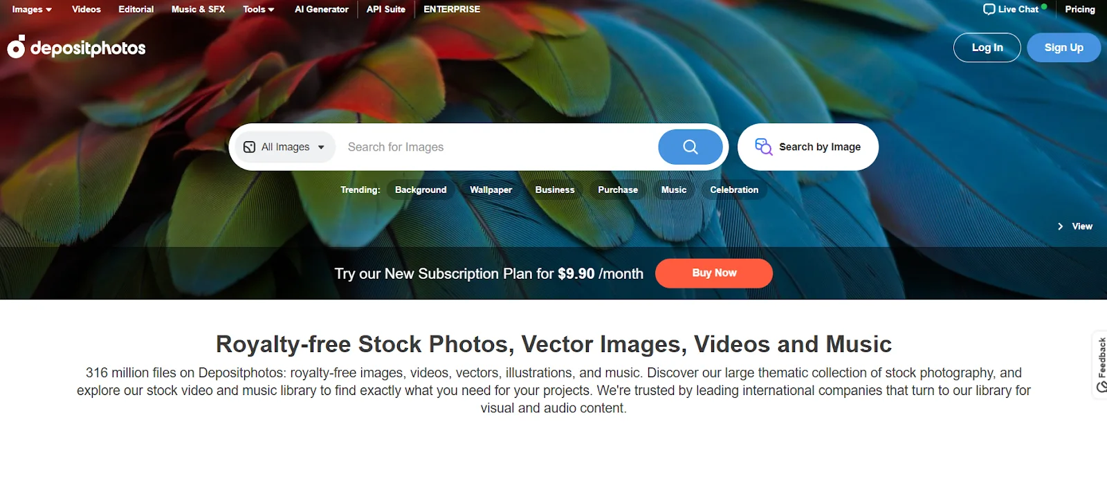
The brand’s identity is elegant: a neutral palette with bright accents allows user visual content to stand out rather than be drowned out. Typography is clean and modern. Communication is professional yet inspiring — it targets designers, marketers, and creators. Depositphotos has created an ecosystem where everything “revolves” around imagery, and visuals act as the language.
As we can see, each brand shapes its unique identity in line with its goals, audience, and market. This analysis shows that the most important aspects are consistency in style and meaningful content that resonates with the customer.
How to Create a Memorable Brand: 7 Steps
Developing a strong brand identity isn’t about inspiration or designing “by eye”. It’s a step-by-step process that involves deep analysis, strategic planning, and bold creative decisions. Below are the main steps that will help you stand out among competitors and build a brand that truly delivers results.
- Define your mission and vision.
- What’s behind your product?
- What value do you bring to people, and why does it matter right now?
- Your mission should resonate with both your team and your user.
- Choose your target audience.
- Who is your person? What are their problems, pain points, expectations?
- The better you know your user, the more accurate your communication will be.
- Create a unique identity.
- A brand’s image is shaped by the details: logo, color, font, image style.
- The identity should be consistent across all touchpoints: website, app, social media, advertising.
- Develop the brand voice.
- Choose a communication style. Are you serious, light, creative, or provocative?
- The brand voice should remain consistent across all channels: from email to banners.
- Ensure consistency.
- Develop a brand book that clearly outlines the rules for using the logo, colors, fonts, and tone of voice.
- This helps keep all communication stylistically aligned — which boosts recognition.
- Test and adapt.
- Run A/B testing, analyze audience feedback.
- Brand identity should be flexible: the world changes, and the brand must change with it.
- Don’t be afraid to be bold.
- A brand that leaves no impression loses its chance to be noticed.
- Sometimes an unconventional approach or a bit of edginess is exactly what you need to stand out.
These steps are not a magical formula but a strategic map to help guide you through the brand identity building process. They can be adapted to any team, product, or business scale. The key is to be sincere in your communication and not afraid to show your brand’s personality.
Read also: Best AI Services for Content Creation: from Texts to Images
Common Mistakes When Creating a Brand
Creating a brand is not just about a beautiful logo or trendy colors. It’s a story that must sound sincere and clear to the people you’re addressing. And this is where mistakes often happen, especially at the start. One of the most common is trying to resemble someone else. When young teams are inspired by big names like Apple or Google and begin copying their style, the most important thing is lost — their own face. The result is something familiar but lacking character. The audience senses this — and walks away.
Another frequent pitfall is the lack of a clear strategy. A company may create a cool logo or come up with a catchy slogan, but if there’s no understanding of why it’s all being done, who it’s for, and what exactly you want to say — the result will be vague. When the tone shifts from post to post, colors “jump” between campaigns, and the message lacks a unified idea — people simply get lost. They don’t understand who you are or what sets you apart. As a result, they don’t form a connection or trust.
Sometimes companies focus solely on the brand’s appearance, forgetting about substance. Identity is not just a beautiful logo — above all, it’s a story and the values behind it. If the brand looks cool but lacks a clear message or doesn’t solve a specific customer need — it simply won’t work. The emotional component is key: it’s what builds favorability and loyalty.
Another critical mistake is ignoring feedback. Companies often believe that once something is approved, it’s “forever”. But the market changes, new challenges arise, and audience needs evolve. Successful brands aren’t afraid to adapt — not to change their essence, but to evolve. Flexibility is one of the main traits of a modern brand.
And finally: neglecting the brand book. Many companies have an identity but no document regulating its use. As a result, the logo changes shades, the font changes form, and the tone of messages shifts. What’s lost is the most important thing — consistency, which is what makes a brand recognizable.
Avoiding these mistakes doesn’t guarantee success, but it’s a confident step toward building a strong, long-lasting brand that can withstand competition and evolve with the market.
Identity isn’t just about font, color, or logo. It’s about the feeling a brand evokes the first time you see it. It’s about how the company speaks, how it looks, and how it leaves a mark on your memory.
A strong identity isn’t an expense for a “pretty picture” — it’s an investment in trust, emotion, and recognition.
Ukrainian IT companies have already proven they can create a style that resonates globally. Just look at Reface, Monobank, or Ajax Systems — each of them has a unique face, voice, and character that can’t be mistaken. They’re not afraid to be bold, and that’s exactly why we talk about them.
So if you’re launching your product — don’t postpone branding “for later”. It’s not just wrapping. It’s the story you’re telling the world. And if it’s honest, vibrant, and cohesive — it will definitely be remembered.