The bounce rate is a metric that tells you how many people visited your website and immediately left without navigating to other pages. Different systems have their methods for calculating this metric, so it may vary depending on what you use to measure it. Nevertheless, it is crucial for understanding what is happening on your site and whether it interests people, which is why search engines also consider the bounce rate.
In this article, we will explain what the bounce rate is, how to analyze it, and what actions you should take to improve user behavior parameters.
It's important to understand that many factors influence the user experience — from the reliability of the hosting service you chose for your project to the color scheme and placement of call-to-action buttons. We will guide you through basic improvements you can make to reduce the bounce rate, but the main idea is that the more convenient and useful the site is for readers, the lower the bounce rate will be.
We also recommend reading our article on how hosting affects website promotion and SEO metrics.
How to Analyze the Bounce Rate
It's important to note that different traffic measurement systems calculate the bounce rate slightly differently, which means the figures may vary. Besides Google Analytics, there are programs like Woopra, Matomo, Mixpanel, Heap, and others.
First and foremost, you need to know what counts as a bounce in your specific system. What must happen for a particular session to be considered a bounce? Typically, in Google Analytics, this occurs when a visitor comes to the site and leaves without navigating to any other page. The bounce rate is calculated as the proportion of these short sessions to the total number of sessions on the site. However, this metric has somewhat discredited itself when it comes to mobile applications and single-page websites. For instance, a user might view a single-page site and absorb the information presented very concisely. Is this considered a bounce? Not necessarily.
In Google Analytics 4, which Google is transitioning its users to, an engaged session is described by the creators as "a session that lasts at least 10 seconds or includes one conversion event or two or more page or screen views". A bounce is considered a session with no interactions at all that lasted less than 10 seconds. This allows for a more accurate analysis of interactions on different websites. For instance, if someone is simply reading an article on a blog, they might not click on anything else — but they stay on the site for more than 10 seconds. GA4 takes into account both the time spent on the page and the interactions, making it more flexible.
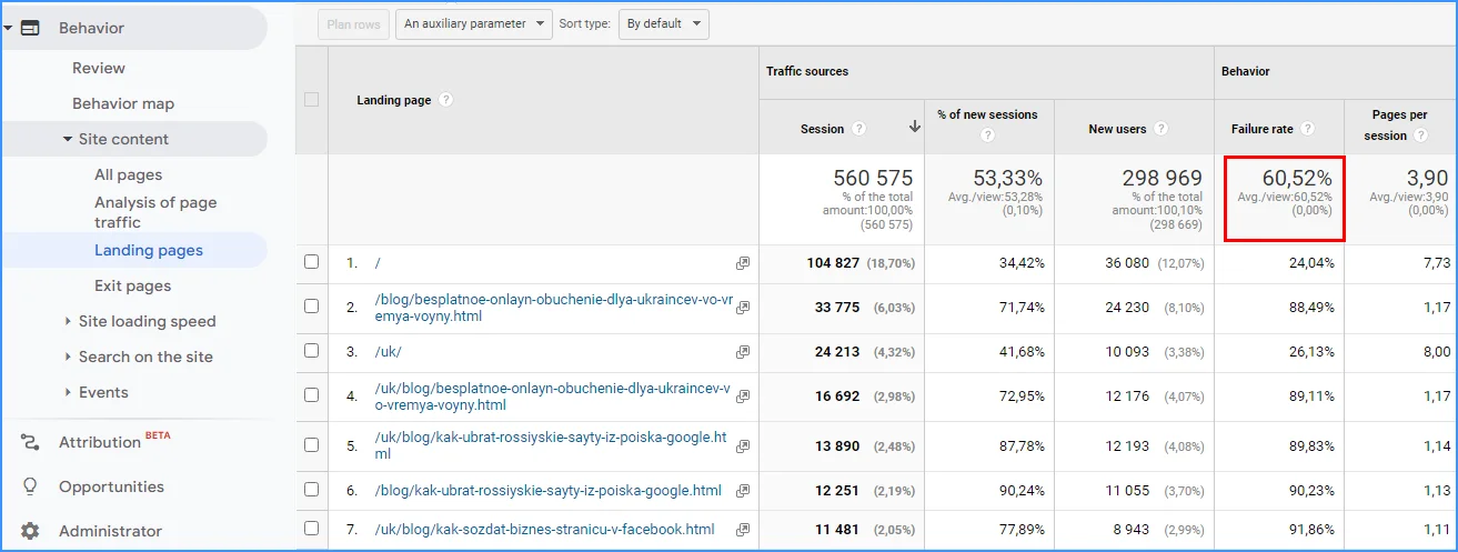
In Google Analytics, you can find this metric by navigating to: "Behavior — Site Content — Landing Pages".
Alternatively, you can view this metric by: "Behavior — Overview".
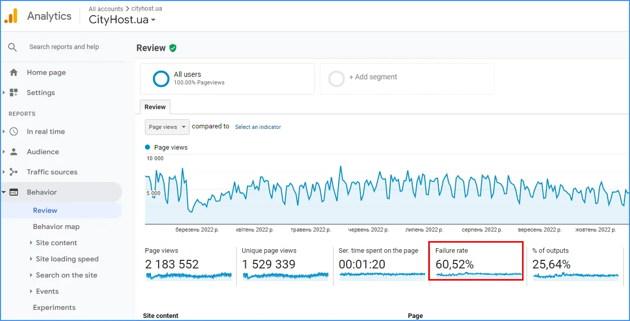
However, since the classic Universal Analytics will cease operation on July 1, 2024, making way for the updated Google Analytics 4, it's better to focus on the new version of the service.
In GA4, the path to find this metric is: "Reports — Engagement — Pages and screens". By default, this metric isn't displayed, and you need to add it manually.
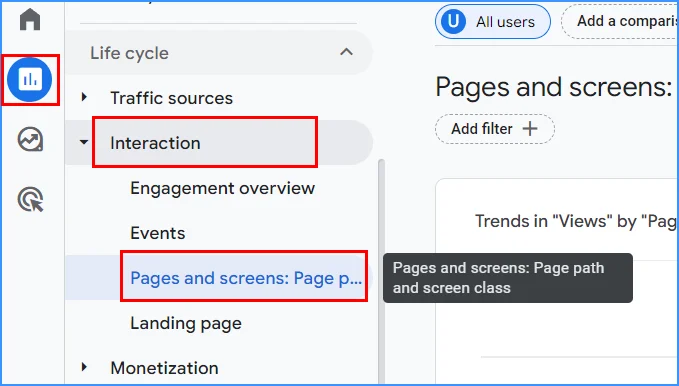
By clicking on the "Pages and screens" section, a user with editor status or higher will see a "Library" button and a pencil icon.
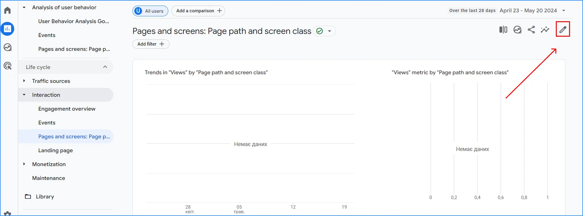
Here, you need to select the "Metrics" tab and click "Add metric".
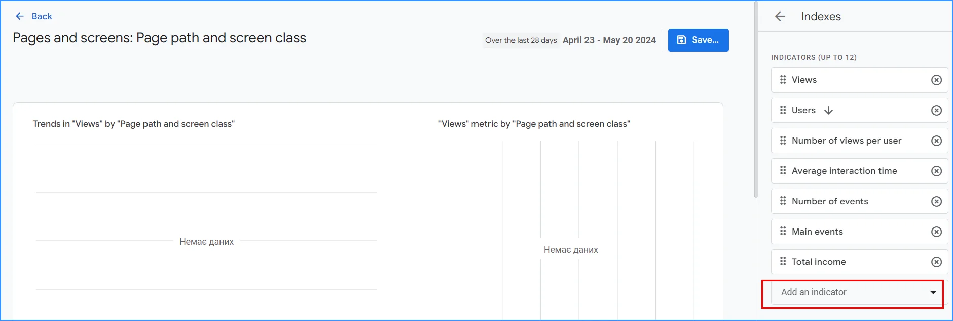
After this, you can choose and add the bounce rate metric from the list.
The system also shows bounces across different traffic channels, allowing you to analyze where users who find the site uninteresting are coming from. You will see this as a percentage. It's important to understand how this percentage is calculated: what proportion of all sessions are those that meet the criteria to be considered a bounce. If you had 10 sessions with 8 engaged (lasting more than 10 seconds, or one conversion, or interaction with the page, such as navigating to another page), the bounce rate is 20%.
If the bounce rate is around 30-50%, this is considered normal: the internet is like a large marketplace, and many people simply pass by your "stall" without buying anything. It's crucial to look not just at bounces but also at how users behave on the site: do they just read, do they make purchases, or do they attempt to buy but abandon their cart?
If the rate rises above 80%, it's time to refine what's on the site. A bounce rate above 80% is a warning sign: you are not engaging with the right audience in the right way. It's essential to investigate what's happening.
Reasons for High Bounce Rates
To reduce the bounce rate, it's worth revisiting those problem areas that cause frequent bounces. You can work with each factor individually and measure the rate again. In general, the following reasons are identified for why users leave a site.
Irrelevant or Low Quality Content
It is important to understand your users and the key queries they use to come to your site. For example, a user might enter the query "buy coffee" and get an article about the history of this beverage. They are not interested in facts; they would like to purchase coffee, so they will leave. Conversely, if the topic is about, say, the history and the query is "how was coffee invented", a catalog of coffee drinks will also be immediately rejected.
Yes, if there is a small banner in the coffee article in the blog with the most popular coffee in the store, it might interest someone, meaning they won't close the page immediately. But in general, it is important to understand which queries will be target for your page and focus on them, otherwise, visitors will leave after the first look at the content. This can also be a problem with content created solely to fit certain keywords: in fact, it works more against the site.
As a vivid example, we can use our own case. Cityhost, in particular, offers dedicated server rental and VPS servers. But if we take the keyword "server", it covers not only the mentioned services but also the purchase of office or home servers, Minecraft servers and other online games, Midjorney servers — the concept is too broad. Using this keyword, you can get a lot of non-targeted impressions in Google, where users either will not click or will leave the site immediately once they realize that this is not quite what they were looking for.
When building a semantic core, it is important to clearly understand user intent, distinguish between informational and commercial queries, and be cautious with keywords that cover too broad an audience.
When building a semantic core, it's important to have a clear understanding of user intent, differentiate between informational and commercial queries, and be cautious with keywords that cover too broad an audience.
Incorrectly Defined Target Audience
For example, it was long believed that computer games primarily interest men. But statistics show that women also play games eagerly, and in some genres, women aged 25-35 make up the overwhelming majority of players. If you tailor a landing page for such a game with the message "strictly for men's entertainment", you can lose your audience and customers.
Sometimes the real target audience is significantly different from expectations. To identify the target audience, you need to read research on your market segment, conduct surveys on social networks, analyze existing sources of traffic — gender, age, devices, and other available indicators, which can be seen using services, for example, Google tools.
Negative User Experience
If a user feels uncomfortable on a site, they will immediately go to the websites of your competitors with a well-thought-out and implemented structure. Poor usability includes low loading speed, eye-straining layout, technical issues, excessive advertising, and so on.
Any obstacle that slows down interaction, annoys the visitor, or causes misunderstanding increases the likelihood that the person will leave your site and go to competitors.
How to Reduce Bounce Rate on a Website
The bounce rate indicates, as we have already written, that either the content posted on the site turned out to be irrelevant or uninteresting to the audience that was attracted there, or its use is hindered by how the internet project is structured. Therefore, to reduce the bounce rate, you need to work with the content of the site and its design. It is important to pay attention to user experience — whether all pages work correctly, whether the website "lags" when loading any of them.
Create High-Quality Relevant Content
It's important for content to provide users with what they want to see and to answer relevant questions. For example, for the query "comparison of technical specifications" of computers or cars, people will likely look for review articles that help them consider a purchase. A simple product catalog won't satisfy them. Often, people complain that when they come for a specific purchase, the page is overloaded with texts written for search engine optimization, filled with "fluff" and uninteresting, and they have to search for specific information about the product.
Content should be properly structured: use headings and subheadings, tables, lists, and illustrations.
Ensure that relevant content is posted on your site:
-
Article Topics: What are the articles on your pages about? Are they written just for keywords, or do they genuinely answer relevant user questions about the product or blog topic?
-
Search Queries: What queries lead users to your site, and are they relevant to your theme?
-
Meta Tags and Descriptions: How are the meta tags and page descriptions written? Do they create the correct expectations for the page content?
-
Internal Linking: Is there internal linking? This is an excellent way to keep users on your site and encourage them to browse further by providing additional links to other relevant articles.
The main goal of content is to match the user's intent and address their needs. If a user finds what they need on your site and successfully resolves their questions with your information, they will not only stay longer but also return regularly.
Read also: Thank You Page on the Website: How and Why to Design It
Work on the Technical Aspects of Your Site
From a technical perspective, it is important to make consuming content on the web resource easy and pleasant. First and foremost, take care of the design so that pages are not overloaded with banners, pop-ups, or bright details. All of this not only distracts but can also slow down page loading, especially if the visitor's device is not very powerful.
Loading Speed
The loading speed of pages can vary depending on the browser, so it is worth checking the most popular ones, such as Chrome, Opera, and Firefox. If the results are unsatisfactory, try the following:
-
Optimize the Code: Excess code executed on the page increases loading time.
-
Reduce the Number of Elements on the Page: It’s better to have the minimum number of elements.
-
Compress Images and Videos: Files that are too large take longer to load.
-
Use Caching.
You can use speed measurement tools that provide recommendations for improvement, such as Google PageSpeed Insights.
More about site loading speed and ways to improve this metric.
Mobile Version or Responsive Design
If your site has not yet been adapted for mobile phone screens, you should do so now: a significant number of users access web resources from mobile devices. According to statistical data from Exploding Topics, more than 60% of internet project traffic comes from mobile devices. Moreover, a website without the support of mobile screens is not competitive!
Design
First and foremost, ensure that all design elements are displayed correctly. Broken layouts or non-functional buttons can lead to user abandonment. If the design of your internet project hasn't been updated in a while, it's worth allocating resources and time to refresh it. It's always sensible to favor more minimalist options so that nothing distracts from the information on the page or causes difficulties in navigating the site. You can hide parts of the menu, leaving the option to open it when needed, and optimize buttons and banners.
Consider inviting less tech-savvy acquaintances to test the site. It should be easy for even them to use. Information is consumed quickly, and there are many sources of information on the internet, so any irritation or obstacle can cause a visitor to close your web resource.
Advertising
You should assess which audience your site's advertising, particularly contextual ads, is targeting. If it attracts the wrong people, it's worth optimizing the ad targeting, the message of the ads, and the places where you post guest articles. You might need to change your approach, experiment with targeting, or modify the design and content of the ads.
Experts like those at Semrush recommend not fixating on the bounce rate. If you continuously improve your understanding of your target audience, update the design every few years, and work on the content and usability of the site, the bounce rate will gradually decrease on its own.


