The main purpose of landing pages is to encourage visitors to take a certain action - purchase a product or order a service. And the design of the site plays a big role in this. After all, if the site is inconvenient to use or has an unattractive design, then there is a great risk of losing the main part of your customers, as they will simply go to your competitors. In this article, we will consider the most common mistakes that are most often made when creating landing pages.
Overview of the main errors
Usability . Once on your site, the visitor should immediately understand what the purpose of the page is, what benefit he will receive when buying your product, and what action the visitor must take to receive it. If a page does not meet these requirements, then such a page can be considered useless.
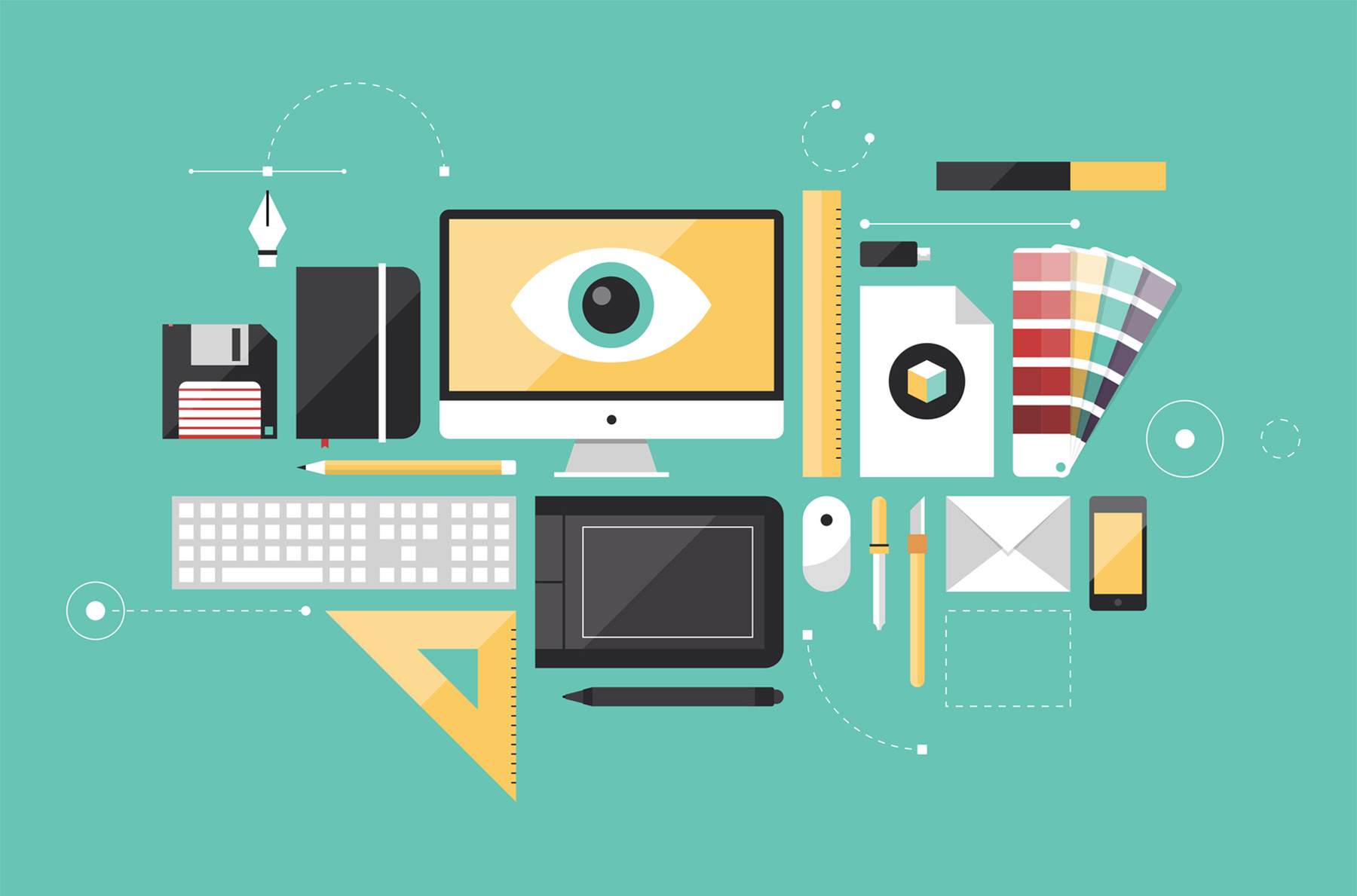
Use of graphic objects in large quantities . There is no need to clutter the page with a large number of graphic objects. Use it only when necessary, as an excess of graphics does not bring any benefit, but only distracts the attention of visitors.
Using modal windows . When placing additional information that may be of interest to visitors, use modal windows. This will be much more convenient than redirecting site visitors to a new page.
You will also be interested in : Why teach courses on creating websites ?
Don't use red when designing a call-to-action button . Red color is usually associated with danger and aggression. Therefore, its use should be abandoned. Calmer colors such as blue or green will be the best options.
Make your call-to-action button more prominent . Carefully consider the color scheme of the landing page. The text information and the button should stand out clearly against the background of the site.
Enter only the necessary information on the site . There should not be any extra information on the site. Only everything necessary for the visitor. The text should be structured (have a heading, subheadings and lists). As a result, visitors to the site will be able to find the information they need with a cursory look at the page.
Do not ask for unnecessary information . When creating a purchase or subscription form, try to avoid a large number of fields to fill out. Only the necessary information will be enough so as not to frighten the buyer. In addition, if you require a phone number or email address, state the purpose for which you are requesting this information and how it will be used. The visitor must be sure that it will not be passed on to third parties and that his mobile phone or mail will not be flooded with spam.
You will also be interested in : Free site creation by yourself .
Highlight profitable offers . If tables with different prices or tariff plans are placed on the page, then with the help of graphic elements you can highlight the most profitable option or the option that is in great demand among buyers.
Tell us about the benefits of your products . Every buyer is interested in the question of what benefit he will receive when buying this product. Therefore, it will not be enough to simply list all its advantages. You have to tell how this product can help the customer in real life.
Was the publication informative? Then share it on social networks. We remind you that you can buy unlimited hosting or register the lviv.ua domain at the CityHost hosting company. For technical questions, contact the online chat or call ? 0 800 219 220.